
Experimenting with a new look for my blog
Hello dear blog readers, thank you for continuing to read Raven's Nest blog even though I post somewhat less regularly this time of year.
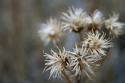
I am experimenting with a new look for Raven's Nest. I would really appreciate your honest feedback on the changes I have made. The most dramatic change is that now the background is white instead of black. Hopefully this is easier on the eyes -- easier to read (for those of us with vision problems, myself included) I have always liked the way my artwork and photos glow vibrantly against a black background (as it still is at my photoblog, Land of Little Rain) but I think in the interest of keeping my readers happy over here where I post more text, I might keep it white like this.
I am still tweaking the banner at the top (am working on a new design-graphic for the title bar), the sidebar and the html -- My ultimate goal is to clean up the blog, simplifying it so it is super easy to find old posts on topics of interest to you.
Please tell me what you think -- honestly -- of the changes. Thank you very much for any feedback.


14 Comments:
I love the black but the white looks good too. I like your photo and I'm stealing the poetry quote of the day :)
Nikki is fine and biopsy clean but 8 teeth removed. Kitty & Sam loves.
HUGS
Delurking to say I like the new look. Do you do the HTML yourself? Since I switched to the new Blogger I'm just not confident messing with it.
I agree with the way the photos look on the black, but you're right, the text is more difficult to read.
I love it! Not that I didn't like your other - but this is easier to read. Great photo too.
I like it a lot! The banner is splendid and the white background is indeed much easier to read. Excellento!
And yes, if I had constructive criticism I would tender it, but I really do like what you've done here...
Good morning, Maureen. I'm just dropping back by to thank you for the lovely comments you left at 'the friendliest flower'.
I keep track of new posts by blog authors I enjoy through Bloglines (and I also tried GoogleReader). This does not notify you by e-mail but rather is a web site you would log in to to see updates to your subscriptions. I sent Tammy very brief e-mail and would be happy to forward it to you but don't find your address here; you'll find mine in my profile if you want to pursue it. Otherwise, judging by the work you've done to tweak your blog, I think you'd take to it like a duck to water without any prompting.
hey Star -- you're welcome. And thanks for the Bloglines suggestion. I already do use Bloglines, but I don't look at it often enough and the new posts accumulate in enormous piles that are a bit overwhelming. I use my email every day many times a day, and I am much more comfortable in the email environment .. so I actually prefer to get announcements to the dozen or so blogs I read regularly, in my email box.
I also get emails alerting me that someone has left a comment on one of my blogs. That way I can save the comments, archive them, search them (I use gmail which has an incredible search function) and return the comment at my leisure.
I know bloglines is a great service and I just need to get more used to using it.
also that's weird you don't see my email address on my blog. it's in my profile.... hmmmm
Hello,
I like the new look and it is much easier to read black on white than versa visa. Good choice using serif type as well. (I think you used one before.)
The layout is still intersting but clean. I like the banner, but like your photography so much that it probably doesn't matter which is showing up. I agree the photos show better on a black/dark background but appreciate how you are willing to promote word here and visual there (other blog) in interest of best legibility.
I will say I tend to not visit (at least not for very long) noisy blogs with too much visual clutter and too many incongruent colors, unless they are arranged incredibly well. Just my aesthetic, and your new layout suits that. (I liked the old one, too, though!)
I like the new cleaner look, though on a PC in IE the site is wider than the browser window.
I am going to read your blog more regularly from now on.
thank you deb and rachael, for your feedback. Everyone who has told me how this site looks, how it reads, whether they like the new look or not ... and most importantly whether it is functioning well -- or not -- THANKS YOU, because it's invaluable to me as I learn how to tweak the site and make it really good.
Deb -- I agree about using a serif font -- from having done graphic design in the past I know it's easier to read a serif font. I also used to follow a rule NEVER to mix serif and non-serif, but somehow on this blog I occasionally want my heads or subheads to be different - so I may keep using the san serif for the sidebar or whatever.
The photo in the banner at the top is experimental. Eventually I want to get back to something I make in Photoshop with links in the photo, but for now I am just wanting something up there that fits.
Rachael, thanks for telling me how it look in IE on a PC. I am not using a Mac again (after years of windows) and I love it. I also use Firefox and will NEVER ever ever go back to IE ever again. (can you tell I'm passionate about that? heehee) But I know the majority of people use IE so I need to accomodate that. I'll see what I can do. I'm not a codie, that's for sure.
Looks great to me. Love the new banner. The whole thing is elegant, as are all your posts!
I always enjoy seeing what you are going to do next... yes - I liked the photos on the black background - yes again- it is easier to read the words against the white...
Thanks for the inspiration!
I like the new look -- black backgrounds are difficult for me to read.
On my iBook, this page is wider than my window. But it is a little iBook.
I like it, is it a new template?
Post a Comment